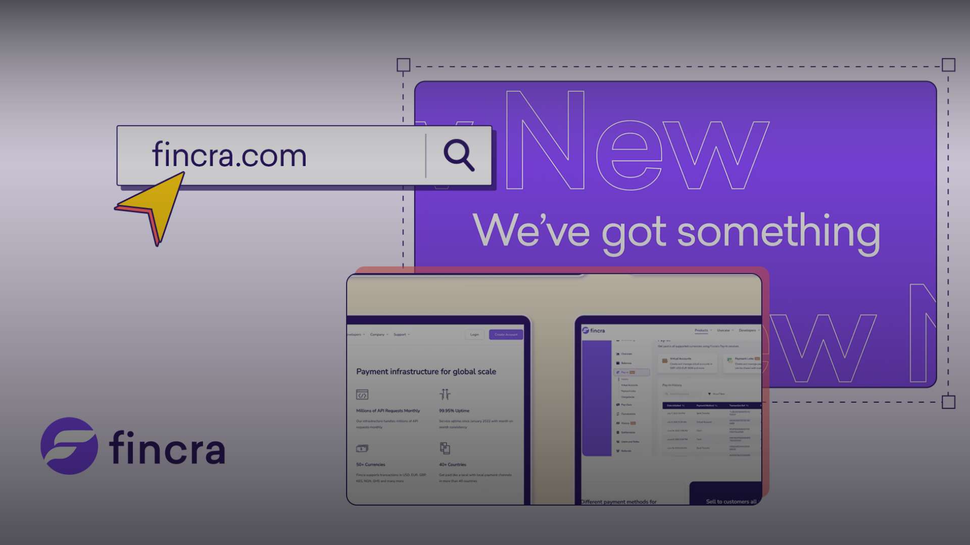
At Fincra, we’re always looking for ways to improve the online payment experience for our customers. That’s why we’re thrilled to launch our new and improved website, which we’ve designed to offer a seamless and secure payment experience like never before.
As the Head of Design at Fincra, I led the initiatives behind the revamp. In this article, I will be giving an insight into the inspiration behind the new websites and the steps we took, the new features and functionality and explain how they’ll benefit our customers.
Getting started
Revamping the Fincra website was our most significant marketing activity for the first quarter of 2023, and we had to get started with intense and detailed research. We researched industry leaders and looked at over 50 different websites.
The majority of them were fintech companies. We also ensured that we look between local companies in Nigeria like Paystack, Flutterwave, Piggeyvest, etc.
We also looked internationally at Dlocal, Stripe, and Wise. We also looked at non-fintech, but companies we can consider industry leaders or people that have changed the game, like Amazon.
During this research, we looked out for how they built their website, branding elements like their colours and what worked for them in terms of backgrounds, how they worked with contrast and text sizes, and how they maintained consistency throughout their respective websites.
After the research, we started drawing out and designing the different pages.
There’s a lot of improvement from our previous website. Let me take you through some of them.
A modern and user-friendly design
One of the key changes you’ll notice on our new website is its modern and user-friendly design.
We’ve completely overhauled the layout and organisation of information, making it easier for merchants to find what they want.
Ease of navigating was a factor we considered while building.
Mobile responsiveness
In today’s world, more and more people are accessing the internet on their mobile devices.
That’s why we’ve prioritised ensuring that our website is fully optimised for mobile.
We also designed our new website to be fully responsive, meaning that it will look great and function smoothly on any device, whether you’re using a desktop computer, a smartphone, or a tablet.
Loading speed
In addition to our website’s visual and functional improvements, we’ve made significant changes to improve loading times. We know that in today’s fast-paced world, customers expect websites to load quickly and smoothly, and we’ve prioritised delivering on that expectation.
To optimise for this, we did several things to ensure the site is very lightweight.
One major thing we did was to make sure that we handcrafted some of the elements on the website from scratch. We had to handcraft some of the SVGs, animations etc., to have control of the size. We converted them into scalable formats, compressed them and ensured the website would load fast for our users.
Scalability
We also made sure that we built the website to ensure scalability. Scalability here means that we built the website in a way that would make it easy to appropriately categorise new features, products etc.
More engaging content
At Fincra, we believe that content is king. That’s why we’ve prioritised including more engaging and informative content on our new website.
Whether you want to learn more about our products or stay up-to-date on industry news and trends, you’ll find a wealth of informative and engaging content on our website.
From blog posts to case studies to informative guides, we have designed our new website to be a one-stop shop for all your payment-related needs.
In addition to providing more content, we’ve made it easier than ever to find and access that content. Our new website features a more intuitive and user-friendly layout, with clearly defined sections for different types of content.
For example, we have a ‘Use Case’ category where we highlight how businesses across different sectors can use our products.
Our brand
At Fincra, we take our brand very seriously. Our brand is not just a logo or a tagline but a reflection of who we are as a company and what we stand for. That’s why we’ve made it a priority to reinforce our brand identity on our new website.
One of the key ways we’ve done this is by ensuring that our website is consistent with our existing brand guidelines. Every aspect of our new website aligns with our brand identity, from the colours and fonts to the messaging and tone of voice we employ.
By reinforcing our brand identity on our new website, we’ll build greater brand recognition and loyalty among our existing customers and attract new customers who share our values and appreciate our commitment to excellence. We’re excited to showcase our brand identity on our new website, and we invite you to explore and experience it for yourself.
Conclusion
We’re thrilled to introduce our new and improved website to the world. These changes will help us provide a much better payment experience for our customers, and we’re excited to see the positive impact that they’ll have on our business.
As a merchant, we invite you to check out our new website and experience the future of payments. Thank you for choosing Fincra!


