Our vision is to make the moving of money and value as easy as sending a text message and we strongly believe in incorporating this into our brand identity.
Fincra is a secure payment solution for fintechs, platforms and global businesses. We provide payments infrastructure with cross-border capabilities that enable fintechs, multiple platforms and global businesses to accept payments securely, make payouts globally and scale their businesses across borders.
Our vision is to make the moving of money and value as easy as sending a text message and we strongly believe in incorporating this into our brand identity.
As a new brand, we understand the importance of creating a unique brand identity – something to set us apart. In doing this, rather than simply beginning and ending with an aesthetically pleasing logo, we kept in mind that our brand identity should embody everything Fincra stands for – our vision, mission, and core values. It was important to us that we create a brand identity that evokes trust and reliability in the minds of our customers and the general public.
Our Logo
Several iterations of our current logo were created and eventually, we narrowed it down to a few key elements that we believe to be an ideal representation of our brand.
The circular icon of our logo represents the world, and essentially our cross border capabilities. The dash lines in the logo were structured like the letter “F” for Fincra. If one looks closely, the lines are shaped like an aeroplane to represent the movement of value at a high speed. All of these visual elements represent our vision of moving money and value as easily as sending a
text message.

Our Brand Colours
As a brand, the goal is to stand out and avoid unnecessary cliches, and we applied this in our creative process through our colour selection and application. We selected purple as our primary brand colour because it represents wealth and value, as well as peach for our secondary colour because it represents joy and warmth, with lighter and darker variations for accents and expansion of our colour palette. The rationale for these colour choices is to communicate our strengths (value and movement thereof) and the emotions we want our customers and the general public to feel when they see any of our visual communication assets.
The primary and secondary colours will be used interchangeably as background colours for all our design assets. The accent colours will be used in limited amounts, as their purpose is to highlight key points we want to draw attention to.
We intend to expand our colour palette further by introducing more accent colours. These will be used extensively in the future for our illustrations and motion assets.
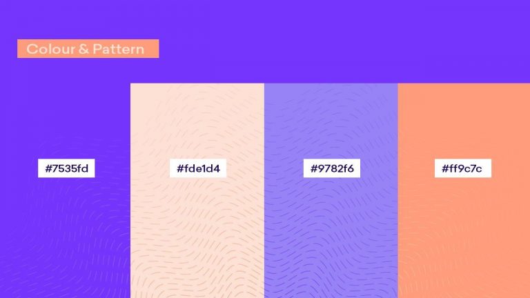
Our Brand Colours
The wavy patterns we chose for our assets and the gradient in the opacity of the lines point to our core strength of moving value from one point to another, with speed. The dotted lines together connote value being moved as well as a type and shadow of the dotted and wavy lines on currency notes. All these elements come together to show the capacity we have to make sending money and value as easy as sending a text message.
Our Typography
Our type system is based on modular scaling – a series of type sizes that relate to each other because they increase by the same ratio. The rationale behind this is to promote consistency in our digital assets and branding materials. It ensures that we do not make random alterations to the font and the size. The modular scaling we adopted is the 8pt typography scale. The use of a type system is not to constraint the use of type but to prevent excesses and ensure consistency across Fincra branded products.
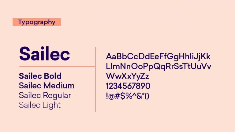
For our type selection, we selected Sailec. Sailec is a geometric sans serif typeface that looks modern, crisp and timeless. It is a font that will remain relevant for many more years to come.
A lot of thought and hard work went into creating our brand identity so as to establish trust in the hearts of our core customers and the general public, establish Fincra as a unique brand, without any design cliches, as well as enforce our vision visually, even in the littlest details. Our rockstar design team worked tirelessly to ensure that everything Fincra stands for is communicated visually. Want to see how we put these awesome design elements together?
Visit our website https://fincra.com/ and connect with us on Instagram, Facebook, LinkedIn and Twitter
Subscribe to our YouTube channel to watch cool tutorials on how to use our products. You can also give our products a quick spin by signing up for a demo here: https://sandbox.fincra.com/auth/signup

